E. McKnight Kauffer (American, 1890–1954) was a pioneer of commercial art—the profession known today as graphic design. He believed that the street was an art gallery for the people. While living in England between the two world wars (1914–1940), Kauffer produced radical posters for advertising that introduced modernism to the public. For Kauffer, any emerging form of expression that deliberately broke from the past fell under the broad concept of modernism. As a modernist, Kauffer experimented in provocative ways with line, form, space, and color to promote services and products. He did not limit himself to posters, and designed a remarkable range of book covers, rugs, theatrical productions, and more, continuing his work in New York from 1940 until his death.
Kauffer resisted defining himself with one place to call home, one community of friends, or one artistic style. He was constantly in motion, fulfilling a lifelong impulse for travel and a hunger to experience something new. Kauffer and his friends embraced modernism in their creative work, lifestyle, and attitudes toward sexuality, gender roles, and politics. Though Kauffer considered himself a progressive and an egalitarian, his commissioned work tells a more complicated story about his ideals, his privilege, and his perspective on race. Over the course of two world wars and dramatic advancements in technology and communication, Kauffer designed for the quickening pace of contemporary life, until it outpaced him. Through dynamic periods of celebrity and struggle, Kauffer discovered that the only constant in the career of a modern designer was change.
Kauffer’s parents divorced when he was three, and he was temporarily placed in an orphanage. Reunited with his mother after two years, Kauffer spent his youth in Evansville, Indiana. At 13, Kauffer left school to paint scenery at the local opera house. Soon after, he joined a traveling theater troupe. In 1909, Kauffer sent his parents this postcard of his design for a theatrical backdrop, proudly signed with his name and the date.
Kauffer eventually settled in rural California, where he worked on a fruit ranch before finding a job at the San Francisco bookshop and gallery Paul Elder & Company in 1910. Here he acquired a lifelong passion for books. Elder also hosted Kauffer’s first exhibition of paintings in 1912.
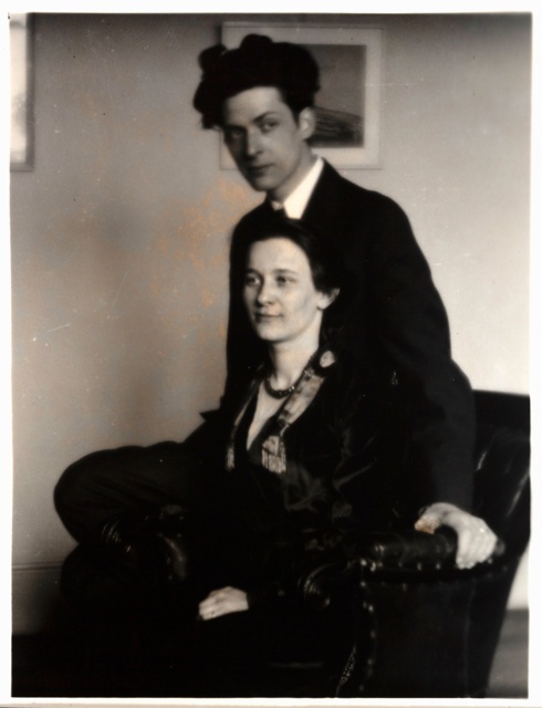
Kauffer arrived in Paris in the fall of 1913 and enrolled at the Académie Moderne. Soon afterward he met Grace Ehrlich, a talented American pianist. The two shared a love of art and music, and together they translated a biography of artist Paul Cézanne from French into English. They married in July 1914, one month before the outbreak of World War I. Unable to afford passage to the United States, they fled to neighboring England.
Kauffer’s formal artistic study began at the Mark Hopkins Institute of Art in San Francisco. He likely drew this realistic sketch from a plaster or stone model during class in 1911. Kauffer continued his coursework at the Art Institute of Chicago the following year. While in Chicago he also attended the Armory Show, which introduced him to modernist European art.
The Museum of Modern Art, New York. Gift of The Lauder Foundation, Leonard and Evelyn Lauder Fund, 1983
travel
advertising
transportation
London Underground
The Underground included a growing network of tram, bus, trolley, and train lines, both above and below ground. To sell these transport services, Kauffer introduced new artistic references with each poster. In Watford shows the influence of Vincent van Gogh’s cool color palette and watery garden views. For Reigate, Kauffer chose a Japanese style for his flat rendering of trees and the stamp for his signature.
Kauffer’s love of landscape was a good match for his first Underground poster commissions, which illustrated scenic destinations outside London that were reachable by public transport. For his first solo exhibition, Kauffer included the poster designs for The North Downs and Godstone alongside paintings and drawings that depicted the French and English countryside.
Railway stations became urban art galleries as Frank Pick, head of publicity for the London Underground, launched a major poster campaign for the company in 1908. Posters encouraged ridership, providing practical information about new rail lines and destinations. They also attracted immediate attention from commuters and the press for imagery that expressed the new ideas and styles of modernism.
In Europe, Kauffer became familiar with the works of Paul Cézanne and Vincent van Gogh, two late 19th-century artists. He began to imitate their techniques in his own paintings. Over the next several years, Kauffer’s style evolved as he was influenced by a variety of artists. The critical reception to his art was mixed, but Kauffer was frequently celebrated for his strong use of color.
In the summer of 1916, the Kauffers rented a cottage in the same village as their friends the Coburns. Alvin Langdon Coburn was a celebrated portrait photographer, but he and Kauffer spent the season experimenting with abstraction. Coburn created a series of “vortographs,” including the one shown below. These abstract works sparked a great deal of controversy among Coburn’s fellow photographers.
The Museum of Modern Art, New York. Jeanne C. Thayer Fund, 1977
After declaring himself a vorticist, Edward Wadsworth began making precisely carved woodcuts translating urban and industrial forms into complex geometric abstractions. Kauffer was fascinated by Wadsworth’s prints, and the two developed a friendship while occasionally exhibiting alongside each other. Kauffer adopted elements from Wadsworth’s art into his own practice.
Vorticism
Vorticism was a British movement in art and literature that was founded in 1914. Vorticism’s angular style was strongly influenced by images of machinery in motion and other representations of early 20th-century industrial technology.
Kauffer began his first experiments with vorticism in printmaking. In Housetops and Flight, he turned his subjects into geometric forms, using the balance between black and white to flatten the picture plane and convey a sense of motion. In preparation for Flight, Kauffer described carefully and obsessively observing birds in the sky. But he was also looking to 19th-century Japanese prints, and likely drew inspiration from the print reproduced below.
A breakthrough moment in Kauffer’s career was a solo exhibition of his watercolors in 1917. Roger Fry organized the show, which included Suspension Bridge. As Fry described in his accompanying catalog essay, Kauffer had begun fracturing planes and abstracting pictorial elements, as well as drawing attention to the flatness of the paper. These artistic choices were a direct influence of the style of cubism.
Cubism
Cubism was a European art movement that began in 1907. Cubist artists combined abstraction with an attempt to represent multiple planes simultaneously, thereby representing several points of view at the same time.
The Museum of Modern Art, New York. Gift of the artist, 1939
art exhibition
The London Group formed in 1913 with the aim of regularly exhibiting a broad spectrum of British modern art. Elected secretary of the group in 1917, Kauffer designed the posters and invitation cards announcing its exhibitions. In his 1919 poster, Kauffer illustrated a pair of joined figures in a confrontational stance. The masklike faces are suggestive of a modernist trend among European artists who turned to African and tribal sculpture as a source of inspiration and appropriation.
Images courtesy of Simon Rendall, photography by Hugh Gilbert
label
Kauffer’s first commercial commission after his Underground posters came from a Manchester-based cotton exporter. Kauffer designed labels for cotton bales sent to Latin America. He treated these labels as mini travel posters, portraying sunny, exoticized locales that he drew from reference photographs. His graphic style and depiction of figures was derived almost directly from the posters he had seen in Munich, Germany. Ultimately, Kauffer designed eight different groups of labels over 12 years.
Inspired by German poster artists, Kauffer used flat color patterning to express modernity in his commercial art. Germany, like Great Britain, was a colonial power whose advertising often featured people from Asia, Africa, and the Arab world in servile roles. Skin tone and facial features were exaggerated to emphasize otherness. Kauffer actively adopted this racialization, at times copying explicitly from German designers, including Ludwig Hohlwein.
As the war drew to a close, the Underground’s new practice of commissioning modern artists to design its publicity materials became popular with a handful of adventurous clients. Among them was the department store Derry & Toms, which was drawn to Kauffer’s interpretations of German posters. Kauffer began designing for Derry & Toms in 1917, but it was not until 1919 that he merged the flat planes of color from German posters, the sense of motion adopted from Japanese prints, and the rhythm of vorticism into a single design approach.
The textile company Vigil Silks was owned by Alec G. Walker, an art collector who was an enthusiastic champion of vorticism. Kauffer’s design of diagonally juxtaposed planes of stripes and grids was based on patterned textile swatches from the company. But the imagery echoes the vorticist abstractions of Edward Wadsworth. The poster raised controversy—how could an abstract image sell silk? Evidently it did just that and Walker continued to hire Kauffer to design for Vigil
In January 1917, a few months after making the woodcut Flight, Kauffer transformed the image into a poster design. He submitted it to the Poster Gallery section of Colour magazine, which featured unpublished commercial artwork to encourage businesses to employ artists. In 1919 Kauffer’s friend Francis Meynell picked the design to advertise the British Labour Party newspaper Daily Herald. The bright, cheerful yellow and flock of birds taking flight signaled the rise of postwar Britain.
The Museum of Modern Art, New York. Gift of the designer, 1939
art exhibition
The London Group no longer suited Kauffer’s ambitions. He approached Wyndham Lewis about forming a new artists’ collective that could support its members in producing work for industry. In the spring of 1920, Lewis, Kauffer, Wadsworth, and other artists formed Group X. Public reception fell flat and the group disbanded after only one exhibition.
Lent by The Metropolitan Museum of Art, Purchase, The Mrs. Claus von Bulow Fund Gift, 1987 (1987.5)
Kauffer painted what he considered his most significant work, Sunflowers, in 1917. Fusing his abstract style with influences from Vincent van Gogh and Paul Cézanne, the painting, reproduced below, was met with critical success. Kauffer’s 1921 reinterpretation, seen here, was the last work of art that he would complete and exhibit for years to come. That same year, Grace McKnight Kauffer gave birth to their daughter, Ann. Kauffer’s career as a poster designer had taken off, and he exclusively pursued a new field: commercial art.
The tagline—”Winter Sales Are Best Reached by Underground”—was a pitch to increase ridership by reminding savvy female shoppers to take the Underground in stormy weather. Kauffer’s women, bundled in overcoats or obscured by umbrellas, are largely androgynous. Drawing on both 19th-century Japanese prints and cubist abstractions, these silhouetted figures battle against slanting rain, wind, or snow.
A new series promoting easy access by Underground to London museums featured objects that Kauffer selected from the institutions’ collections. For the first poster, advertising a geology museum, Kauffer illustrated a massive angular stibnite. The Underground received so many inquiries from a baffled public that it was necessary to issue a definition of the mineral formation. For each poster in the series, Kauffer tried out a different stylistic approach. The designs sparked debate in the press for their varied uses of abstraction.
Kauffer regularly published and lectured about posters. The publication of this book, The Art of the Poster, firmly established him as an expert on the subject. Written as a manual for contemporary designers, the book also traces the history of advertising over two centuries and argues that artists must have a say in modern poster design.
Eno’s “Fruit Salt” was an effervescent supplement akin to an antacid. To market the product, Kauffer designed a crowing rooster against a rising sun, in flat planes of vibrant colors and repeating forms. The poster was such a success that the company sent Kauffer a check for an additional £50. Though the bonus appeared generous, the company used the rooster in future marketing campaigns without further compensating Kauffer.
The Museum of Modern Art, New York. Gift of Mr. and Mrs. Alfred H. Barr, Jr., 1968
propoganda
Kauffer was one of the first modernist artists commissioned by the EMB. For one of a set of five posters promoting Caribbean exports, Kauffer frames a scene of three Black men harvesting bananas in a lush, geometric jungle. Through a unified visual expression, Kauffer renders the people, the land, and the bananas as commodities for consumption. Black bodies are depicted without individualized features or signs of their oppression.
Empire Marketing Board
The Empire Marketing Board (EMB) was founded to increase sales of goods from colonies of the vast British Empire. From 1926 to 1933, the EMB’s publicity department commissioned artists to design posters to promote imperial trade. This advertising perpetuated racist stereotypes and unequal racial hierarchies. Indigenous people were illustrated performing manual labor, while white figures were shown as supervisors or at leisure. The posters, in large, custom-designed wooden frames, were prominently displayed in urban settings. They were also used as visual teaching aids in 27,000 schools throughout Great Britain.
The Underground frequently commissioned posters that promoted seasonal travel, but Kauffer’s image illustrating the transition from winter to summer is full of mysteries. Skipping right past spring, the poster also neglects to mention or depict the transportation system entirely. A bare tree floats beside a silhouette of a man in an overcoat who morphs into a tennis player amid sunshine and foliage.
An early enthusiast of the cinema, Kauffer also found professional opportunities in the field. He cofounded and designed the logo for the Film Society in London in 1925. The organization was responsible for introducing much of the British public to modern experimental film. After the distributor held up the release of Alfred Hitchcock’s silent thriller The Lodger, Kauffer was hired to design the main titles and the intertitles between scenes, setting a menacing tone to the story of a serial killer in London.
The Museum of Modern Art, New York. Given anonymously, 1961
advertising
film poster
film
movie
While working on The Lodger, Kauffer submitted several poster designs to the film’s distributor, Gainsborough Pictures. The sketches were rejected, which made national headlines: “Posters Too Good for the Films,” the papers reported. “They are sort of Futurist and quite attractive,” wrote the distributor, who feared they would misrepresent the films as “expressionist” pictures. Whether the design for Metropolis was included in this submission remains unknown, but Kauffer’s film posters never went into production.
In 1927, Kauffer joined the advertising agency W. S. Crawford as a part-time employee. He preferred to work entirely as a freelancer, but this position provided a steady income. Kauffer stood out among his peers at the agency. He worked at an architect’s easel and used expensive artist’s materials rather than poster paints. The agency, which also had an office in Berlin, exposed him to new design methods and styles, including airbrushing, photomontage, and the latest typefaces.
The Museum of Modern Art, New York. Gift of the designer, 1939
Athena
suffrage
In Britain, some property-owning women over the age of 30 had obtained the legal right to vote in 1918, but equal voting rights were not granted until 1928. The left-leaning Labour Party supported women’s suffrage, and Kauffer designed this poster in 1925 to promote the party’s monthly journal for women. He featured a woman’s head shown in profile, wearing a helmet. The depiction is a reference to the mythological Greek goddess Athena, a symbol of independence.
Feminism and Misogyny
By all accounts of those who knew him, Kauffer viewed women as his equals. Throughout his life, he maintained close friendships with women and championed their professional pursuits. While Kauffer was far more sensitive in his depictions of women than many of his contemporaries, there are noteworthy contradictions in his work. In 1923, Kauffer designed the book cover for Woman: A Vindication by the antifeminist Anthony Ludovici, which endorsed a misogynistic ideal of a woman as solely a wife and mother. Kauffer’s vibrant cover put a cheery spin on a devastating text, made more complicated by the possible interpretation of the image as a woman’s genitalia.
In 1919, Kauffer was a founding member of The Arts League of Service (ALS), an organization that increased appreciation of and access to modern art and culture. Kauffer designed the ALS emblem, a figure caught in stride between city and country, emphasizing the geographic reach of the group’s programming. Wyndham Lewis, poet T. S. Eliot, and dancer Margaret Morris were among the artists who participated through theatrical and dance performances, lecture series, a printed bulletin, and exhibitions.
T. S. Eliot and Kauffer met through The Arts League of Service and formed a lifelong friendship. Once Eliot became the director of the publishing house Faber & Faber, Kauffer was commissioned to illustrate each of Eliot’s single-poem publications, which were subsequently republished as the Ariel poems. “Yours is the only kind of decoration I can endure,” Eliot wrote Kauffer in 1930.
Smithsonian Libraries and Archives, Purchase from the Margery Masinter Endowment
poetry
book cover
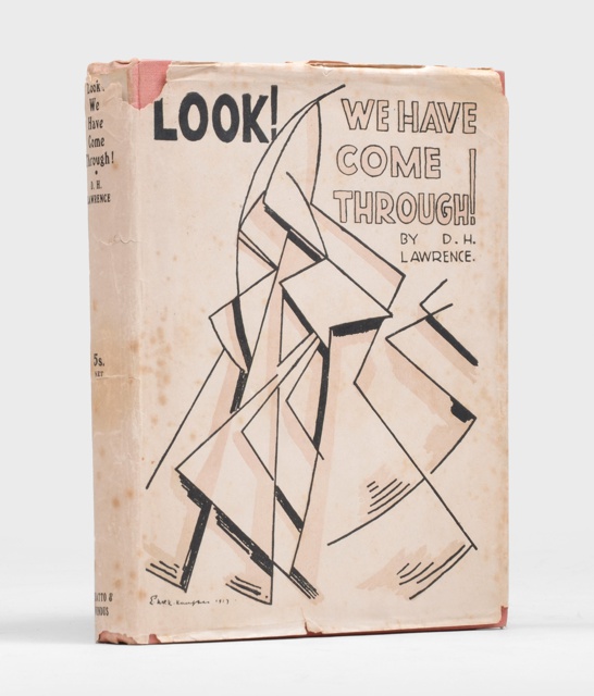
This design for D. H. Lawrence’s collection of poetry is the first of hundreds of book covers by Kauffer. A pyramid of angular shapes represents two figures in swift motion side by side. The publisher thought that the sophisticated cover would attract the book’s target reader. But one critic found the imagery impossible to understand, describing it as “a mixture of two broken combs and the fragments of a knife-cleaner.”
In 1912, the poet Harold Monro opened the Poetry Bookshop, which became an important gathering place for writers, critics, and admirers of poetry and literature in London. Monro commissioned Kauffer for the cover of his monthly Chapbook, which featured essays, stories, plays, poetry, and criticism. Kauffer also designed a colorful shop sign that made headlines when it hung outside the Poetry Bookshop’s new location in 1926.
lithograph with hand-colored additions in brush and brown and blue watercolor
Gift of Mrs. E. McKnight Kauffer
For his illustrations of Don Quixote, Kauffer expressed the psychological unraveling of the protagonist as he assumes the persona of a knight and undertakes a quest of honor and love. Kauffer’s own struggle with the project’s deadlines echoed the emotional collapse of Don Quixote. He wrote in a 1928 letter to a friend, “In the meantime my ‘Quixote’ remains a dream. Poor fellow he lies in a heap—of only lines and . . . patterns—none of them yet put together.”
Nonesuch Press was founded in 1923 to apply the newest mechanical methods of production to fine book publishing. The founders, Francis Meynell, Vera Mendel, and David Garnett, engaged contemporary artists to update historical and contemporary texts. These affordable deluxe editions were important commissions for both Dorn and Kauffer. The Week-End Book was a best-selling compilation of fiction and nonfiction features, games, poetry, recipes, and other entertainments for readers’ weekends away.
The 18th-century fable Vathek follows an immoral leader of the Islamic empire on an imaginary pursuit of knowledge and power. Nonesuch Press commissioned Dorn for the illustrations of a new edition that indulged popular British fantasies of Arab culture. Dorn’s whimsical frontispiece pictures a palace courtyard with a floor suggestive of her geometric rugs.
lithograph with hand-colored additions in brush and gouache
Gift of Mrs. E. McKnight Kauffer
illustration
literature
Kauffer enjoyed projects with contemporary writers and sought out novelist Arnold Bennett for a collaboration. For Bennett’s Elsie and the Child, Kauffer lets the reader peer into walled gardens and curtained windows as an eyewitness to a narrative of class tension in the household of a doctor in London. At Curwen Press, a team of women artisans executed the illustrations. They used stencils with gouache, creating rich, textured areas of color with no outlines.
Smithsonian Libraries and Archives, Purchase from the Special Collections Endowment
literature
Throughout the 1920s, Kauffer was sought after by a range of publishers. His modern interpretation lent itself to everything from royal biographies and classics to mysteries and manifestos. Kauffer proudly signed his book jackets as artworks, and, as with his posters, he approached each subject with a new style.
The performance of Catherine Parr, or Alexander’s Horse, a one-act burlesque comedy, called for costumes bold in color and personality. In the play, King Henry VIII fights with his wife Catherine Parr over everything from boiled eggs to the color of their horse, Alexander the Great. Kauffer’s costume for Henry VIII exaggerated the king’s famous broad-shouldered silhouette and the fancy embellishment on his clothing.
In the late 1920s and early 1930s, Kauffer was involved with many theatrical organizations ranging from the experimental to the mainstream. He designed logos and programs for many of them. When Sidney Bernstein (1899–1993), a cofounder of the Film Society, opened the new Phoenix Theatre, Kauffer produced a logo featuring an elegant phoenix, a mythological bird rising from the flames.
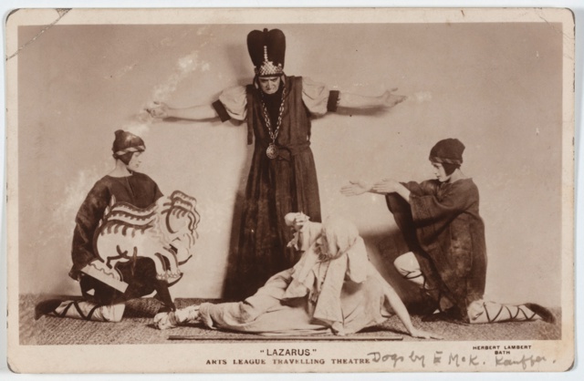
Kauffer and Dorn’s provocative costumes and set designs dazzled on stages across England in performances by The Arts League of Service’s (ALS) Travelling Theatre. Active for almost two decades, the troupe entertained enthusiastic audiences with one-act plays, poetry, dance, folklore, and more, reaching a new village daily on tour.
Vibrant woven textiles such as Avis boosted Dorn’s reputation in the 1930s. In 1934, she established Marion Dorn Limited, and became one of few female business owners in the textile field in London. Her studio handled everything from fabric design and production to distribution and interiors. Dorn also designed her own logo and advertisements.
In this portrait by friend Carl Van Vechten, Dorn sits confidently against the backdrop of her Scallop Shell textile designed for Warner and Sons—her most significant client of the 1930s. Dorn wrote to Van Vechten from London upon receiving the portrait, “Now about the pictures, I am absolutely delighted with them. I think they are the best pictures I have ever had taken.”
Textile manufacturers began screen-printing as a low-cost way to produce short runs of contemporary designs. The new technique allowed many artists, including Dorn, to transfer their drawing and painting skills to designing patterns for textiles. The use of screen-printing even simulated the painterly effects of color washes and brushstrokes, as seen in Langton and Zodiac.
Kauffer and Dorn approached the rug as a medium for modern art and often included their individual signatures within the rugs’ patterns. One of the most important design books of the era was The New Interior Decoration by friends Dorothy Todd and Raymond Mortimer, who chose Kauffer’s vibrant mural design as the frontispiece. Chapters on rugs and textiles also included Kauffer’s and Dorn’s latest work.
The department store Fortnum & Mason was a destination for modern design. The store hosted exhibitions that showcased fashionable furniture and fittings for the home, which were sold in its interior design department. Dorn produced 50 scarves for the retailer and Kauffer completed a range of marketing materials.
The British Broadcasting Corporation (B.B.C.) invested in modern graphic and interior design in the late 1920s when corporations had still not widely adopted the style. Kauffer designed covers for B.B.C. yearbooks that featured a colorful zigzag radio wave to suggest the company’s power of communication and energetic spirit. Broadcasting House, London’s B.B.C. headquarters built in 1929, featured modern interior design, most of it proudly executed by British firms. Dorn’s rugs decorated the third-floor waiting room.
Dorn designed floor coverings and textiles that responded to their architectural surroundings. At Claridge’s Hotel, her circular carpet’s directional lines helped visitors navigate the hexagonal lobby. Dorn’s fringed fabric Lodore enclosed the circular staircase of an estate in Surrey by noteworthy architect Oliver Hill. Against the home’s spare and smooth white walls, the textile added textural contrast.
Kauffer’s The Progress of Brighton mural enlivened the entrance hall of the Embassy Court apartment building in Brighton, built by Wells Coates in 1935. In Kauffer’s design, the façade of the Brighton pavilion and statues that he photographed in Paris float along a horizon line with oversize maritime elements inspired by the paintings of Edward Wadsworth. The mural was installed by architectural decorators Eugene Mollo and Michael Egan using a patented technique that combined photography and painting.
Murals were one of Kauffer’s primary contributions to the modern public interior. These early mural studies were two of many designs for a publicity campaign promoting a new exhibition and events venue. Here Kauffer uses a quadrilateral form to create an illusion of space—a two-dimensional space frame. This motif would become one of Kauffer’s signatures, used repeatedly to suggest dimensionality in his graphic works at all scales.
Manufactured by The Wilton Royal Carpet Factory, Ltd.
wool and jute
Lent by The Metropolitan Museum of Art, The Cynthia Hazen Polsky Fund, 1992 (1992.64)
carpet design
In the press, Dorn’s and Kauffer’s designs were often featured alongside work by their innovative European contemporaries. Alvar Aalto’s bentwood furniture appeared with both Dorn’s and Kauffer’s rugs in exhibitions, stores, homes around London. These reasonably priced armchairs sold for £3–4 when Aalto’s furniture debuted in Britain at Fortnum & Mason in 1933.
Kauffer produced this poster for the MARS (Modern Architectural Research) Group, which was founded in 1933 to encourage a public interest in modern architecture. The group’s 1938 New Architecture: An Exhibition of The Elements of Modern Architecture, advertised here, involved remarkable leaders in the field, including Wells Coates, Maxwell Fry, Walter Gropius, László Moholy-Nagy, and Le Corbusier.
The first-class lounge on the Orcades II offered the familiar comfort of a living room while introducing new aesthetics. The decoration surrounded passengers with scenes of motion in the air and on land. Dorn’s furniture upholstery featured overlapping silhouettes of graceful birds in flight. Artist John Armstrong’s 14-foot-long mural of a herd of horses galloping through a fantasy landscape provided the backdrop.
Kauffer developed a diverse graphic identity to promote Orient Line’s new passenger liners to Australia and New Zealand. He designed everything from luggage tags and table assignment cards to promotional pamphlets and posters. Kauffer’s Orient Line logo customized many objects of daily use, including tableware that remained in production for decades.
Kauffer developed a diverse graphic identity to promote Orient Line’s new passenger liners to Australia and New Zealand. He designed everything from luggage tags and table assignment cards to promotional pamphlets and posters. Kauffer’s Orient Line logo customized many objects of daily use, including tableware that remained in production for decades.
For 15 years, Kauffer had promoted the Underground as a way to reach a destination. But here, he celebrated the raw energy that powered the system. Kauffer fused man and machine, drawing on images he had seen in Soviet propaganda posters. Electric bolts emanate from a muscular arm and clenched fist, which punches through a spinning turbine that doubles as the Underground logo. Blue currents of energy are drawn from a simplified yet recognizable Battersea power station.
The Underground was constantly seeking ways to alleviate congestion, and frequently commissioned posters to promote the use of trains during off-peak hours. This pair encourages play at night and shopping by day. The airbrushed rays of color suggest mechanical precision.
In 1936, Frank Pick commissioned new upholstery for transport seating from leading designers including Dorn, whose Chesham and Colindale designs were used in railway carriages into the 1950s. Dorn received a design brief that the textiles be durable and hide dirt but also bring a cheerful atmosphere to the cars. She visited the John Holdsworth mill in Halifax, England, to observe and better understand the manufacturing process.
These two designs were made for display on the sides of moving trucks. Kauffer depicted Shell-Mex’s associations with energy and speed: a biplane flying through blocks of color and a sports car speeding along a looping track of lines and letters. The skilled quality of the lettering on the Aeroshell poster may reveal one of the first design contributions from Sidney Garrad, Kauffer’s newly hired studio assistant.
One of the most successful of Shell’s campaigns featured a broad range of professions that “preferred” to use Shell oil. The posters conveyed the product’s eclectic consumer base by including both the expected (motorists) and the unexpected (actors). To represent magicians, one of the more curious subjects, Kauffer shows two palms in contrasting black and white suggestive of a sleight of hand. A hand, often modeled after Kauffer’s own, became a recurring motif in his work.
Museum purchase from Friends of Drawings and Prints Fund
travel
travel posters
advertisement
stones
rock formations
In the early 1930s, advertising executive Jack Beddington launched the campaign “See Britain First on Shell,” promoting domestic tourism to sites accessible by car. The prehistoric monument Stonehenge was an iconic destination and played to Kauffer’s strengths as a landscape artist. Yet Kauffer’s decision to showcase the landmark at night, set against a starry sky, brought a dramatic new perspective to the heritage site.
In 1930, Kauffer became the art director for the printing firm Percy Lund, Humphries & Co. The company was co-managed by E. C. Gregory, who was also a major patron of modern art. He and Kauffer established a small gallery in the firm’s office, where they organized exhibitions of work by international artists. These included the first solo exhibitions in London of Man Ray and the typographer and book designer Jan Tschichold, as well as a retrospective of Kauffer’s own career in 1935.
The Charnaux Patent Corset Co. made use of material innovations to develop rubber undergarments for women. The company claimed that geometric patterns of perforations provided support and freedom of movement. Charnaux sought a modern, provocative identity for its brand, engaging Kauffer, Man Ray, Francis Bruguière, Hans Schleger (Zero), and others who worked at Percy Lund, Humphries & Co.
The Mayor Gallery was one of London’s foremost galleries for modern art and design. This brochure advertised a survey of contemporary art arranged in conjunction with the publication of Herbert Read’s book Art Now: An Introduction to the Theory of Modern Painting and Sculpture. Kauffer designed the cover for Art Now, showing an ancient bust with its focus trained on an eye trapped in a geometric web.
5 on Revolutionary Art featured a series of papers delivered at a symposium hosted by the Artists’ International Association, an organization that united artists against fascism. The work of typographer Jan Tschichold, who had fled Nazi Germany, made a significant impression on Kauffer in the 1930s. For this book cover, he emulated Tschichold’s approach to achieving clarity of message with sans serif type, sharp geometries, and deliberate use of white space.
The Reimann School was the first school of commercial art in Britain. Founded in Berlin, Reimann opened in London in January 1937. The school emphasized training in the latest modernist styles from across Europe. Some teachers came from Germany, while others were recruited locally. The school taught courses in topics that reflected the expanding role of the modern designer: display and exhibition design, commercial art, fashion and dressmaking, photography and film, and interior design. Kauffer served on the advisory council and both he and Dorn lectured there part time.
Kauffer understood the allure associated with the emerging field of civilian aviation. His friend Whitney Straight, a race car driver and pilot, partnered with Miles Aircraft to develop the sleek M.11 airplane. With a blurred propellor, the M.11 flies through Kauffer’s airbrushed clouds and signature space frame. A robotic “Shell Man” watches from the ground. Kauffer designed the playful mascot, which appeared regularly in Shell advertisements.
gelatin silver prints, cut paper, gouache and airbrush
Collection of Merrill C. Berman
In the early 1930s, Kauffer acquired a cutting-edge Leica camera and began to experiment with photography. Photomontage emerged as an important element of his design practice. In some cases, such as with this lithograph, he used his own photography. Kauffer incorporated his photograph of a monumental sculpture from the Place de la Concorde in Paris to playfully allude to the term “horsepower.”
Kauffer was one of many artists who helped promote advances in global communication. For most of the 20th century, Britain’s General Post Office managed telephone calls in England based on the understanding that it was administering messages between a sender and a receiver. Here, Kauffer employs an oversize image of a telephone handset. The telephone is held up to a globe instead of an ear, to make “contact with the world.”
The British General Post Office invested heavily in advertising, film, and posters to upgrade its corporate image. In Kauffer’s Outposts of Britain poster series, a space frame device surrounds scenic snapshots showing how postmen can reach even remote corners of the British Empire to deliver the mail.
Kauffer completed the cover design and nine airbrushed illustrations for The World in 2030 A.D. Written by Conservative politician Frederick Edwin Smith, chapters on industry, war, and everyday life envision a highly regulated future society in which women are inferior to men. The chapter on women suggests that childbearing will become an affair of the state involving the use of an artificial womb, as illustrated here.
The Rise of Fascism in Great Britain
Kauffer’s work challenged and communicated messages of radical politics and social upheaval in 1930s Britain. In this era, the power of modernism amplified both revolutionary propaganda and a vision of a better future amid disorder and strife. In the early 1930s, the ideology of fascism and its activity in Italy and Germany provoked debate and intrigue among the British public, including within Kauffer’s circle. But as fascist leader Oswald Mosley gained power in England, strong opposition soon mobilized against his demands for total government control and the suppression of individuality. By 1934, Kauffer began regularly lending his talents to antifascist and peace organizations.
The Greater Britain was the foundational text for the British Union of Fascists (BUF). Why Kauffer was chosen to illustrate the cover is unknown. Oswald Mosley, the leader of the BUF, socialized in the same circles as Kauffer in the early 1930s. Kauffer’s aggressive design features a fasces—a bundle of twigs with a protruding axe—an ancient Roman symbol of power. Mosley adopted this imagery directly from the founder of Italy’s National Fascist Party, Benito Mussolini (1883–1945).
Kauffer’s design for the British Union of Fascists appears to be an outlier. He soon became vocal in his disdain for fascism, most potently through his designs for antifascist literature and organizations. The mocking humor of Kauffer’s cover for Quack Quack compares Mussolini and Hitler with a statue of a Hawaiian war god. For the catalog cover of the exhibition Fascism & War, Kauffer has released the clenched fist of aggression into an open palm symbolizing peace.
Ninette de Valois founded the Vic Wells Ballet Company, which became the Sadler's Wells Ballet, now the National Ballet. Checkmate was first performed at the Theatre des Champs Elysees, Paris, in June, 1937, and in October at Sadler's Wells.
In 1937, the British Council chose Checkmate to represent the best of British modern art and culture at the International Exhibition in Paris, and the production continued to travel. The outbreak of war interrupted this tour, forcing the company to return to England in 1940 and abandon the costumes and sets. Kauffer redesigned them for a revival in London in 1947. Checkmate has since been staged around the world and is still produced today.
In the 1930s, Kauffer returned to painting landscapes in his spare time, particularly when he was in the South of France or at his country home. After many years of collaboration with Frank Pick, Kauffer’s latest styles fell out of favor with him. Kauffer received fewer commissions from the Underground. This autumnal landscape was one of his last.
In 1938, Kauffer and Dorn leased a weekend cottage in the English countryside called the White House, where they retreated full time after World War II began the following year. With few commissions coming in, the couple lived off the land and found comfort in reading, writing letters, and visits from friends, including T. S. Eliot and their neighbors Harold Curwen and Jack and Olivia Beddington. Kauffer converted a small shed into a studio and photographed the surrounding landscape.
When Kauffer and Dorn temporarily split in 1936, their tight-knit community helped sustain them. The time apart reaffirmed their love. Romantic and emotional intimacy, within and outside marital ties, was common among their friends. Mary Hutchinson became a close confidant, as did Aldous and Maria Huxley, the three of whom maintained a love affair in the 1920s. Among Kauffer and Dorn’s set, sexual fluidity was part of modern life.
Smithsonian Libraries and Archives, Gift of Margery Masinter
art exhibition
exhibition brochure
Kauffer’s solo exhibition opened in 1937 at The Museum of Modern Art in New York, introducing his posters to American audiences. Aldous Huxley wrote the catalog’s foreword. Kauffer designed the cover and contributed text on his biography and technique. Writing to Alfred H. Barr, Jr., the museum’s director, Kauffer expressed a crisis of confidence: “My feelings were mixed—sometimes pride and sometimes a sense that I had done so little that was worthwhile.”
During the war years, propaganda took many forms. including textiles. This friendship scarf celebrated a critical political alliance. Kauffer’s design features the figures of Marianne, personifying the French Republic at left, and Liberty, personifying the United States at right. The ribbon-script lettering reminds viewers of the Treaty of Paris, which ended the American Revolution in 1783.
In the 1940s, Kauffer became the most exhibited and collected commercial artist at The Museum of Modern Art in New York. His friend Monroe Wheeler had taken the position as head of the museum’s Exhibitions and Publications Department and hired Kauffer to design many of the museum’s publicity materials and publications. Wheeler endorsed the use of unusual cover designs to “catch the customer’s eye and arouse his interest or curiosity.”
In New York Bernard Waldman, founder of the Modern Merchandising Bureau, championed Kauffer’s talent and connected him with new clients. For American Silk Mills, Kauffer created an emotional design of three patriotic tulips wrapped in barbed wire against a backdrop of Holland’s bombed-out buildings. It ran in the New York Times Magazine and was a critical success. From then on, Kauffer and Waldman held a close personal and professional relationship.
Kauffer created many posters in support of the war effort. His design for the Red Cross was so effective that the organization printed millions of copies, using the work on everything from billboards to postcards. To promote the anti-Nazi resistance leader Josip Broz Tito, Kauffer framed his portrait in arrows, pointing outward to suggest progress and change. In appreciation of his war-relief efforts, Kauffer was named an honorary adviser to the United Nations’ Department of Public Information in 1947.
Museum purchase from General Acquisitions Endowment Fund
leaves
One American journalist reported that nature was Dorn’s notebook. These textiles show the designer forgoing her earlier stylized florals for more realistic representations of grasses and driftwood. Leaves of Grass, shown here printed on silk, was also available on a wipe-clean plastic-coated cotton for easy maintenance.
In 1942, House & Garden magazine named Dorn one of its “Four Outstanding American Designers,” who were identified as having a “profound influence on American styles and trends.” Dorn’s large-scale patterns filled many American homes. The magazine featured her again in 1947 with a portrait by photographer Horst P. Horst in which Dorn is surrounded by the botanical designs and historical motifs that were best sellers.
With a renowned reputation for public transport posters in London, Kauffer utilized his design skills to promote the New York City network in 1947. This poster encourages businesses to purchase poster space in the New York subway system, where their message will have a magnetic power of attraction. Kauffer includes a triangular slice of commuters, the mobile and eager audience for advertising.
Bernard Waldman commissioned this poster to earn the attention and investment of American Airlines for a full campaign. Kauffer chose an unusual color combination to portray a winged helmet, perhaps to suggest the flapping wings of the American Airlines eagle logo. Fashions in Flight messaged the stylish experience of air travel.
Richard Wright’s novel follows a young African American man caught in a deadly downward spiral in 1930s Chicago. Rather than interpreting a scene from Native Son for the cover, Kauffer copied his unpublished illustration for the final scene of Carl Van Vechten’s 1926 novel. The image he repurposed shows an African American man undone by murder. Kauffer rendered a faceless figure slumped over a chair, placing a brick—a murder weapon—at the character’s knees.
Illustrating Race in Literature
In the 1940s and 1950s, Kauffer produced designs for works by both Black and white authors on complex race relations in the United States. Much of the country remained segregated by law and by custom. The struggles for racial justice had not yet reached national discourse. Stories of hardship, perseverance, and white supremacist violence were penned by emerging and established writers. White publishing houses opted to hire Kauffer for these projects over Black designers.
For his book of poetry Shakespeare in Harlem, Langston Hughes proposed working with the artist Elmer Simms Campbell, a prominent African American cartoonist. Instead, Blanche Knopf chose Kauffer to design the cover, frontispiece, and 12 illustrations for Hughes’s poems on life in his neighborhood of Harlem. Hughes wrote to Carl Van Vechten that he removed the book jacket at readings for African American audiences, who disapproved of the gambling emphasis in the cover design.
Hughes was not pleased with Kauffer’s sample sketches for Shakespeare in Harlem. To close friends, he expressed concern with Kauffer’s ability, as a white artist, to draw Black people with accuracy and sensitivity. Hughes wrote particularly of his unease with how Kauffer depicted hair—an important aspect of Black culture and personal expression. However, Kauffer seems never to have been made aware of Hughes’s concerns.
Intruder in the Dust tells a chilling account of an African American farmer, Lucas, who is wrongfully accused of murdering a white man. Lucas is in danger of being lynched by a mob before he is proved innocent with the help of the narrator, a white teenager. Kauffer designed two covers that featured Lucas, but Random House chose to publish an illustration of an empty churchyard cemetery that holds the exonerating evidence.
Invisible Man documents the fictional experience of a college-educated African American man struggling in a segregated society that constantly denies his humanity. Ellison spoke highly of Kauffer’s jacket design, which evoked the narrative’s emotions and tensions of feeling unseen. On the cover, a male face in three-quarter profile fades into the dark background, signaling the psychological strain of the narrator.
Kauffer was a perfectionist, yet he almost always insisted on hand lettering the type. The result frequently brought a quirky irregularity to his designs. Ulysses was a familiar title to many Americans, and Kauffer recognized that the name, rather than an illustration, would be most powerful. He elongated the U so that it rises and fades into the top edge of the cover. The blue L guides the eye downward toward the remaining yellow letterforms.
Kauffer was deeply conflicted about his national identity. Throughout his life, he made contradictory statements about his feelings toward England and America. But the theme of exile resonated with Kauffer. In New York he befriended St.-John Perse, an antifascist French diplomat who was forced to leave France when Germany invaded. For Perse’s book of poems, Kauffer stretched one arm of the letter X out into indefinite space, a metaphor for endless displacement.
Smithsonian American Art Museum Gift of Container Corporation of America
landscape
advertising
cowboys
cattle
The packaging manufacturer Container Corporation of America (CCA) played an influential role in supporting European émigré and American artists. The company made modern design central to its corporate identity. In 1946 CCA featured a series on the 48 states and invited Kauffer, among other artists, including Jacob Lawrence and Stuart Davis, to portray their home states. This is the original artwork Kauffer supplied for the advertisement featuring his native Montana.
In the late 1940s, Kauffer and Bernard Waldman set out west on research trips for a series of American Airlines posters. These adventures resulted in one of the most successful campaigns of Kauffer’s career. The subject of flight had long brought out the best in Kauffer. A painting of Flight, the iconic poster that had kick-started his career, hung in his studio until his death. As the writer Arnold Bennett had described him years before, Kauffer was “as a bird, forever in flight, forever searching for a place to come to rest.”